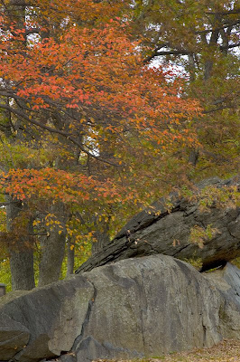
As I work through the images I took on our fall trip, I ran across this one. Taken at the beginning of our drive down the Blue Ridge Parkway, this beautiful fall tree drew my attention, called to me.

The sun was cooperating by hiding behind a clouding, so that if I waited patiently I could get soft lighting. The rocks seemed an interesting foreground. The catch: the wind was blowing just enough to cause some motion blur of the leaves in places at my preferred ISO 100 for landscapes. I played a little in photoshop to get the rocks nicely exposed and then did a little bit of dodging and burning to make the tree look "good."
I found that it seemed pretty, but perhaps ordinary.
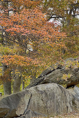
I purchased Topaz Adjust and Topaz Vivacity during the summer. After playing around with the Adjust filter, I went over to Vivacity and came up with this version:

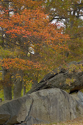
I went back to the original and played around with the Photoshop artistic filters to try to find an artistic effect that would work with this shot. Then I went back to Topaz Vivacity to get the finished look I wanted.

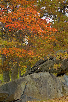
After posting this, I added even more saturation to bring out more of the reds.

I think I like this last version the best, because it keeps the deep reds in the tree, but still gives this a more painted look.
Which one do you like best?
To get the full effect of these photos, you can click on each one and get a larger view.


No comments:
Post a Comment